You can also find my portfolio at
http://pratt-face.artworkfolio.com
You can find me on DeviantArt at
http://pratt-face.deviantart.com
You can find me on Tumblr at
http://pratt-face-art.tumblr.com
Pratt-Face Illustrations
In this blog you will see illustrations done by Aric Pratt. Aric Pratt is a student currently Attending the Academy of Art University in San Francisco; working his way to graduate with a Bachelors of Fine Arts. After collage, he wants to be teach art for high school and work on his own graphic novel, all while taking commissions on the side.
1/31/13
1/30/13
Deviant-Fart
Ok, for those of you who want to see more of my art and see more traditional art, you can always visit my deviantart page here:
Surprise surprise! The name is not gonna be hard to forget lol!
My Character Design

DO NOT STEAL THESE OR I WILL GUT YOU LIKE A FISH.
That being said, these are some concepts for my future graphic novel I will be doing. I have his portrait on the left and years of hard work and concept design leading me to the final version of my character's armor on the right here.
I know it says "Mordred: High Templar", but do not get overly attached to it. During some recent adjustment and decisions, I will be changing the name of the character and the name of the type of warrior he is. Needless to say, Mordred is part of a small elite force (and I do mean small) that is designed for tactical and intense missions that normal people in the military can not normally handle. It takes place in an alternate universe in the future where an experience goes wrong and creates evil mutated zombie-like things. That is all I feel comfortable releasing for now. I will say, however, that I have copyrighted these images and I've worked very hard on them, so if anyone decides to steal anything it will be the end of you. Can you tell I am protective of my baby? LOL.
Sexy Little Fairy
Amongst all the skulls, dark images, and fan art like stuff I have, I don't have nearly enough Sexy Women art. So, I give you my sexy little hornet fairy! My fiancé was nice enough to model for me (that was a fun night lol). I wanted to test myself to draw something I obviously do not normally draw (girly things and fairies). What did I do? Twisted the rules and made the fairy not based off of a butterfly, but a hornet. YAY! Digital
Halo Poster
Big fan of the Halo game series, so I did this Frazetta inspired poster for the release of Halo 4. Even made posters and handed them out at the premier to some lucky fans. Digitally done.
Image Comics Fan Art
Two of the baddest of the bad from Image Comics. Haunt and Spawn baby! They look like they could be brothers. Both of these are my own takes on the characters while still remaining true to the basic silhouettes (I can not stand when people change a character's silhouette with their own "versions").
With Haunt, I made his normally ectoplasmic suit have hard sheet like plate armor as the white portions with a fleshier dark suit underneath. I designed the white plates to have a bone-like look with repeating curved elements in the cracking. I also made his face look more skull like as well.
With Spawn I did some similar things. I integrated the gauntlets and boots to connect with his body and made his face (take a guess) a skull. I always viewed Spawn having this dark look with rugged spikes and chains, so that is what I went with.
Totally Stoned

More awesome digital stuff! Ok, so we have an obsidian man and a viking statue. Has it been done before? Yes. Do I care? NO! The point of these drawings was to incorporate stone into the flesh of human-esqe figures. I am a big fan of obsidian stones and I like the way strong viking women statues look, so that is what I went with. As with a good chunk of my work, sometimes I put the original sketch next to they final product so you can see my progress. I had a ton of fun with these ones and I hope you have as much fun looking at them! LOOK AT THEM!
Sketchy Situations
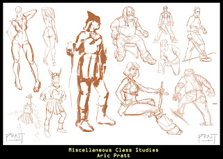
Some of you may wonder what my sketches look like. Well here is a good idea of what my digital sketches could start out as. Who knows, I may actually finish some of these if enough people requested me to do so.
Spider-Man
The AMAAAAAZZZZZZZZINNNNNNNGGGG SPIDER-MAAAAN! I was actually a big fan of the remake. It was a lot closer to the comics and I felt it was more "realistic" in quite a few ways. I modified the look that they gave him in the new movie to include pouches for extra web shooter ammo or skittles. Digitally drawn, of course.
Skull in Contrast
Skull oil painted still life I got bored with and added fun and creative background elements to. Why? Because sometimes I get a little bit crazy. Just a little bit. Anyways, this lovely piece now sits on a wall somewhere in my brother's house.
DJ IN DA CLUB
Feeling a little bit of techno tonight! This was done with water-color and water color pencils. Funny story actually, I was masking off an area to tone the background and the water and paint got under my mask! I thought I ruined the picture but I was able to save it, so naturally I was a happy person. :D
Oh, and ten points to the house that discovers all these items: A Chair, a monkey, a desk, a butterfly, and a clock.
Oh, and ten points to the house that discovers all these items: A Chair, a monkey, a desk, a butterfly, and a clock.
Roman Wednesdays

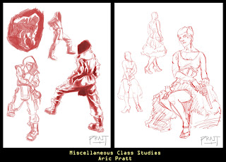
Not like these pictures relate to each other at all, but I drew a roman dude and Wednesday Adams for a fantastic figure drawing class. Digitally done. I know that the sketch next to Wednesday Adams is ugly as ugly can get, but believe it or not that was what I started from with my final! UGH! Hope you love 'em!
Tailor
A little something traditional. Clothed figure drawing is a challenge within itself, so I was quite happy with this drawing. Done traditionally of course.
1/29/13
UPDATE!
Alright anyone who may be watching this blog (unlikely at this point), I am done uploading stuff for today but will be uploading more fun and fantastic stuff soon enough! Right now I am just trying to organize and upload everything I have already done and am trying to post stuff that is well, more interesting.
So STAY TUNED!
So STAY TUNED!
Awww, How CUTE!
Ok, time for some cute pictures I guess... The top is my version of a page from a children's book where a child is given a baby loch ness monster as a pet that loves cheeseburgers. Don't ask, I didn't write it, lol!
The stars and pugs were part of another assignment I had. Basically (similar the skull assignment), you had create a theme (this time two) and have it apparent within all your figures. So, you get shooting stars and thug pugs. The stars were vectors and the pugs were photoshop.
Commissions and Posters
Ok, so the key thing on the top was a commission I got for a real estate company. They wanted me to design a key to place under their logo, and what you see is the final product. The poster on the bottom was an assignment for class, but it was designed to look like a (OMG) real poster you would see on the streets for a real event. The poster was done in vectors.
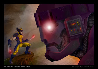
Wolverine Vs. Sentinel
I did this a while ago and it is a little loose from my more modern work, but I still love it. Wolverine and Sentinel? Oh yeah, always a good combination for comic book pornography. Digitally done of course.
Note: When I say pornography, I do not mean it in the literal sense you dirty freaks.
Note: When I say pornography, I do not mean it in the literal sense you dirty freaks.
WOMEN
Some digital drawings of WOMEN doing awesome WOMEN things and being WOMEN. Next to the bigger and better drawn WOMEN are the sketches of WOMEN I drew from real life.
Shapes within Shapes
This was a fun assignment. Basically you take a shape and try to put things in it with the same theme. If you look closely, all the pictures above share the basic outline of the skull on the upper left, only the skull rotates and turns. The theme I went for was dark/halloween (as it was about halloween around the time I did these). In addition to a challenge, this assignment gives you the possibility to design great tattoo designs!
And for some reason a lot of people really like the bat on the pumpkin...
And for some reason a lot of people really like the bat on the pumpkin...
THE SACRIFICE
Back to dark pictures YAYAYAYAY! I don't really know, just some sacrificial service of some kind, done completely with ink and pens. Took FOREVER.
Clothed Figures
I won't be posting stuff like this often, but I do like to show that I am capable of drawing models from real life in the traditional way as well as drawing more dynamic and fun illustrations. I'll probably post a few pictures like this now and again for the hell of it.
ZOMBIES
Not all my work is dark, intense and scary. I do find myself often doodling and drawing silly little pictures and guys such as this zombie.
Cavern Encounter
I could not think of a better picture to open up my blog with. This was an oil painting I did on a 30"X40" canvas. I entitled it, Cavern Encounter. I took a lot of inspiration from Frank Frazetta when I did this and I hope it shows. I actually went through a lot of edits and adjustments with this painting. I was actually able to enter it into the Society of Illustrators Scholarship, and although I did not win, it was a great honor to even be considered for the Scholarship.
Subscribe to:
Comments (Atom)


